


brand identity / social media / printed media
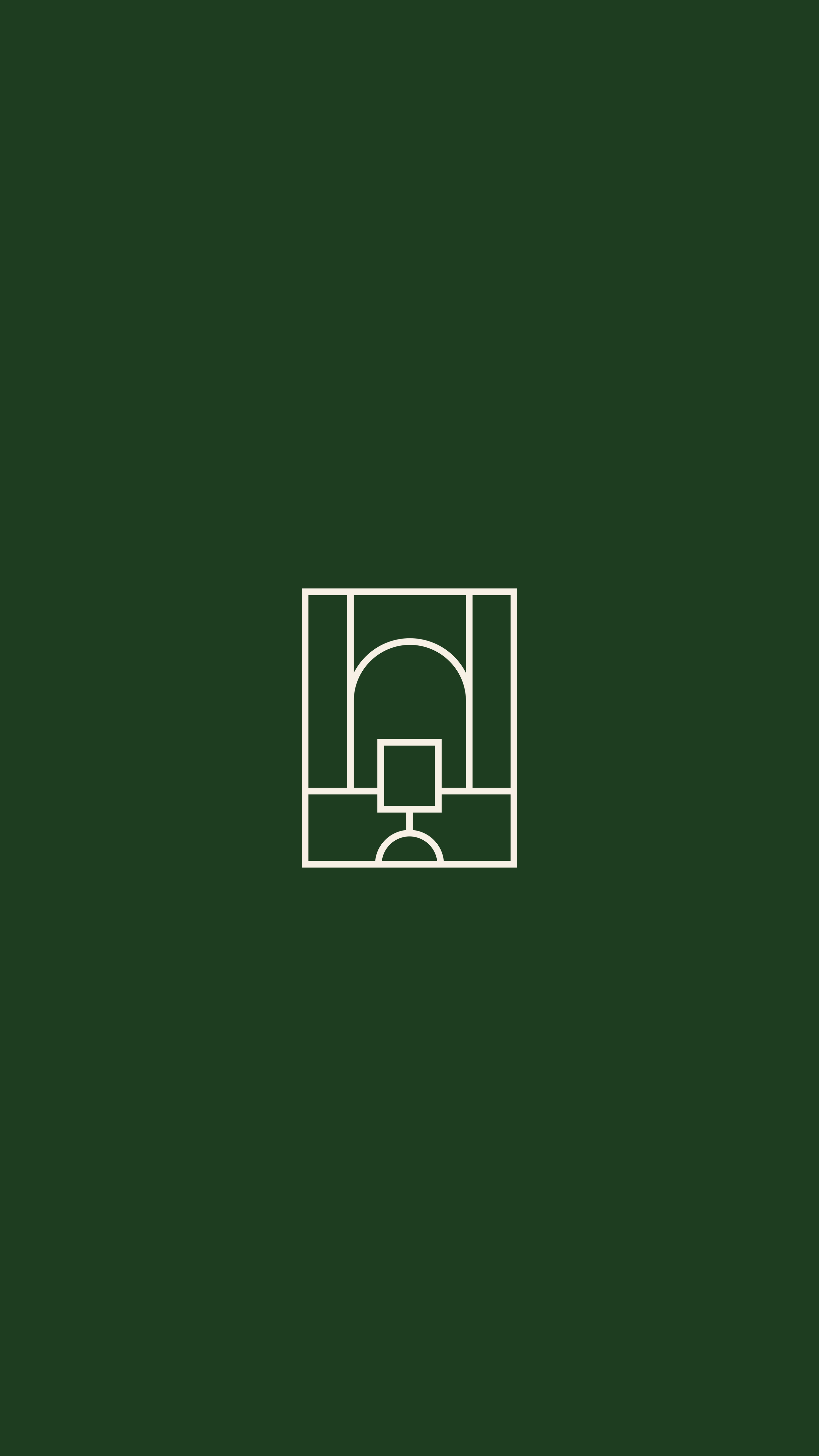
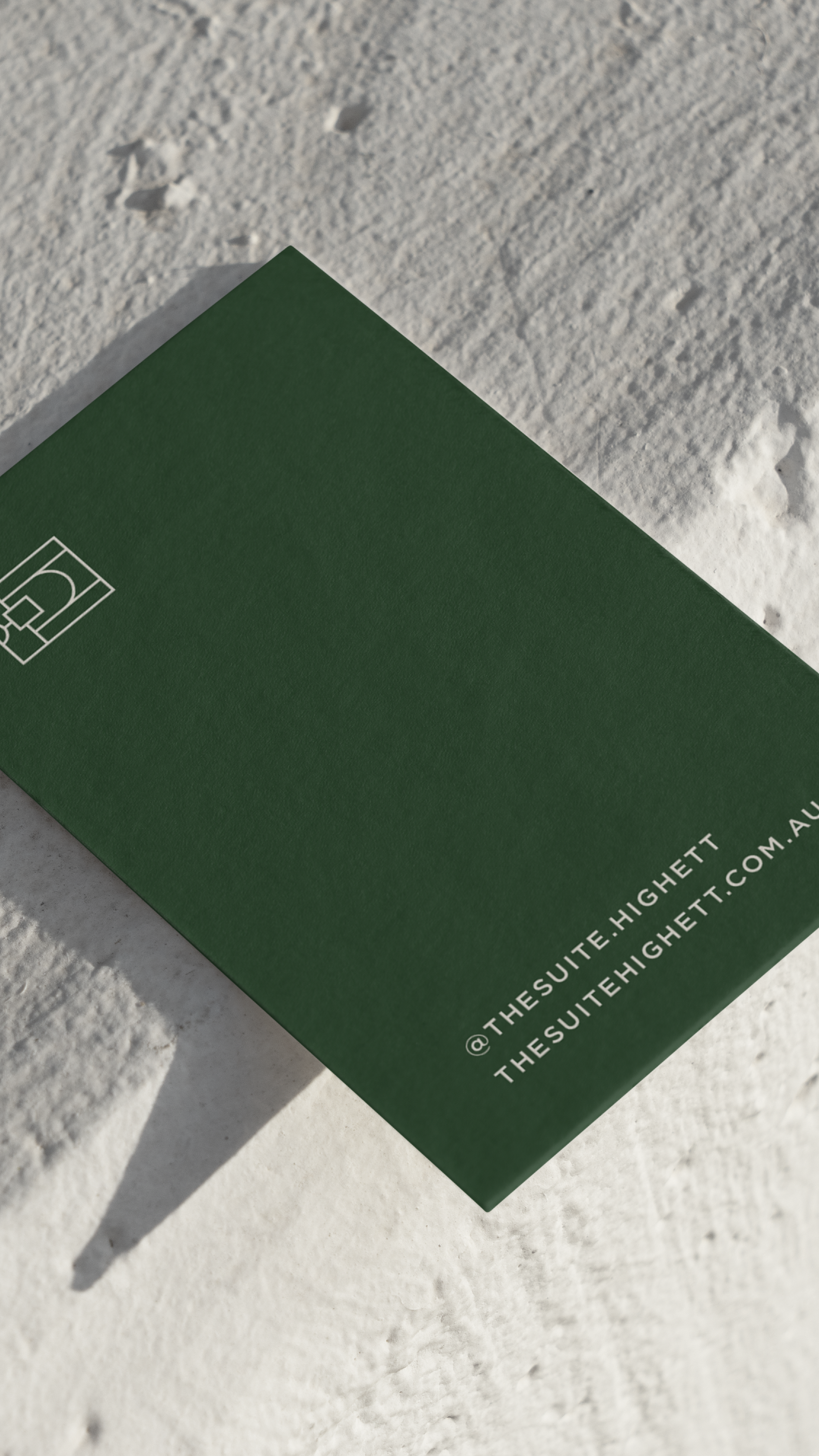
The Suite
The Suite isa boutique salon experience that is home to multiple freelance artists. It’s a space where creativity flourishes. We paired the deep forest green with the cream to create an elevated aesthetic. The logo design is classic and contemporary. My favourite part - the brand icon! We created a geometric shape that mimics a salon chair and mirror. It looks so gorgeous below text and on printed material - and is completely unique to The Suite.


brand identity / web design
Studio Five District
Studio Five District is a social media agency that focuses on high quality content for fashion and beauty brands. Owned by Annalise - who has experience working in marketing for a global fashion brand - she wanted the branded to be elevated and have a signature aesthetic. We wanted to created a ‘NY’ inspired vibe. We picked a minimal palette - only four colours - to create this. It’s sharp, fashion-forward, and I have no doubt this aesthetic will speak directly to her target audience. My favourite thing about this project - the wine red and off-white combo, paired with the sans serif fonts. It’s just so classy!


brand identity / social media
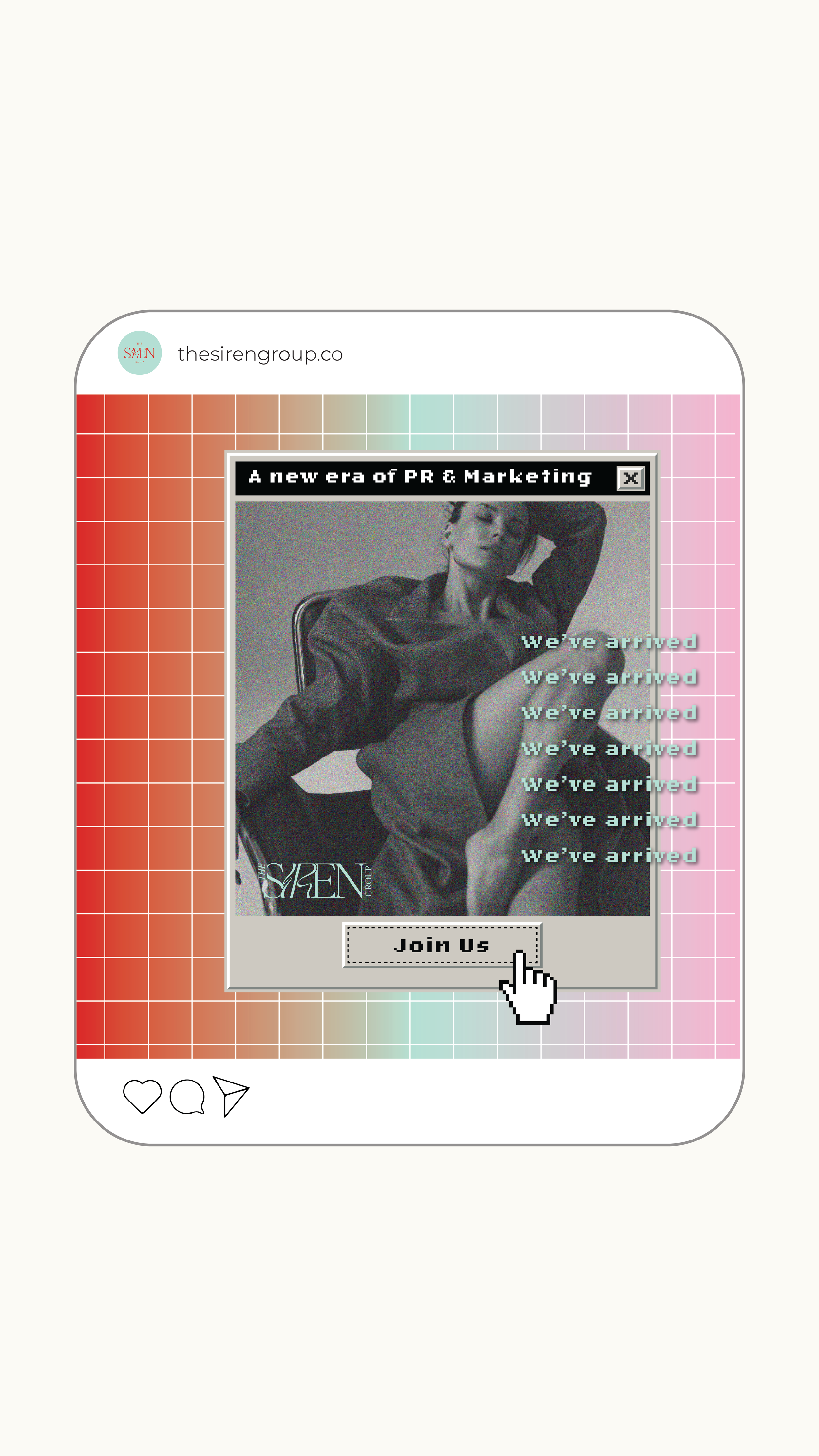
The Siren Group
The Siren Group is a spicy PR agency for creators in the adult industry. Emma found that the management adult PR space was heavily male dominated. The goal was to create branding that was loud, fresh, and could stand out against the heavily dominated male industries. It was only right that we used red - but it was the colours we paired it with that really made it pop. The blue was the perfect addition to this palette to really give it that ‘it’ factor. The logo design combined fonts to create interest, and we played on the word ‘siren’ by creating ripples in the letters that represent loud sound waves. My favourite thing about this project - definitely how the logo design relates to the word in a subtle way.


fashion / graphic design
Neux
-
![]()
print design
This print was designed using watercolour flowers and editing the colours on photoshop. The flowers were strategically placed on the skirt and dress to favour the hemline, side seams, and waist. A reduced scale repeat print was used for the bralette.
-
![]()
care label design
Creative care labels that have ‘self care’ details on the right side - while on the underside will reveal the care instructions of the garment. Small details that really add to the customer experience.
-
![]()
print design
Designed this gradient-floral print that went from a soft yellow to a light blue. It represents the ocean shore meeting the water and that subtle gradient it creates.
-
![]()
hang tag design
Hangtag design included an embossed, heavy weight card paired with a smaller card with a quote to promote self love - a strong factor in the identity of the brand.
-
![]()
fashion design
Studying four years at fashion school - all looks in the collections are designed by myself. I have recently pivoted my business model to a made-to-order, made in Australia brand.
-
![]()
social media
All social media posts are created by myself. At this point I am creating content more than I am designing clothes. I didn’t sign up for this but here we are :’) (I’m sure you can relate as a business owner!!)


social media
@neuxthelabel


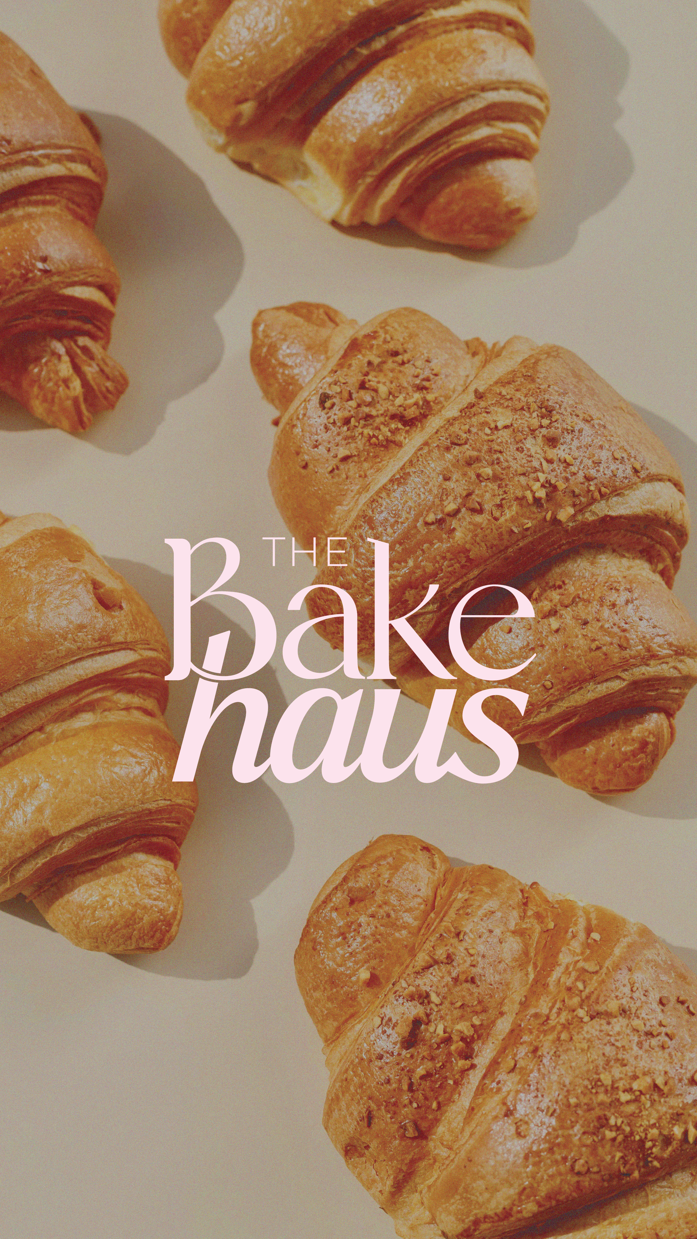
brand identity / pattern design
The Bakehaus
The Bakehaus is a bakery and cafe located in Melbourne who specialise in custom cakes, freshly baked pastries, quality coffee, matcha, and so much more. It really is the home of sweet treats. We wanted a feminine, dainty feel. The colour palette is reminiscent of sweets, chocolate, and cream. We combined fonts to create a custom logo and submark design that was versatile and timeless. We developed 2x custom prints along with custom motifs that can be used individually also. My favourite part of this project has to be the prints! I get hungry just looking at them. Can I have a croissant now please?


brand identity
Married by Bee
Married by Bee is a celebrant and wedding MC business by founder, Bianca (AKA - Bee!). We wanted the branding to appeal to wedding clients - but still have an element of vibrance and fun. We used the play on words with Bee’s nickname - creating a custom Bee submark with love-heart detailing. The yellow also hinting to the bee reference and her desire to reference the businesses playful, happy, and vibrant feel.


Does my work resonate with you? I’d love to chat!


Come say hi on Instagram for all of my latest work! this is updated more frequently than my website.